How big is the issue?
Below is a collection of data to illustrate the significance of The Great Pacific Garbage Patch.
|
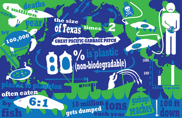
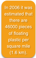
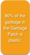
This statistical infographic about the significance of the Great Pacific Garbage Patch was created by National Geographic. It is clear from this infographic that the patch twice the size of Texas is contributing to 1 million albatross deaths and 100,000 sea turtle deaths each year. This is understandable as the ratio of plastic to plankton is an unbelievable 6:1, making ingestion or entanglement easy. But possibly the most unbelievable trend is that the 10 million tons of garbage being dumped each year are ingested as chemicals by the fish that eventually end up on our dinner plate, a problem we’re making for ourselves. And with the life span of a plastic bag being more than double that of a human’s, this plastic problem making up 80% of ocean debris isn’t going away soon either. It is clear from the points made in this infographic that National Geographic is wanting to highlight the significance of the Great Pacific Garbage Patch and the impact it is having on our environment and ourselves.
|
|
|
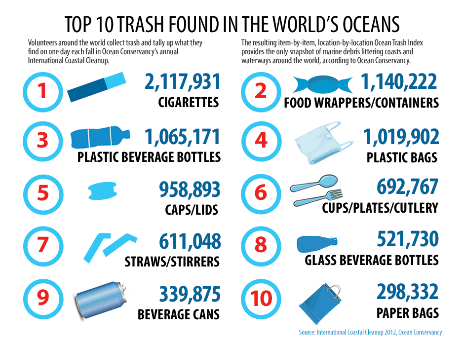
This infographic depicting the top 10 trash items found from an ocean cleanup was created by the Ocean Conservancy in 2012. It is clear from this infographic that there is an excessive amount of rubbish being littered into our oceans, with the top trash product found to be cigarettes, at a count of 2,117,931 cigarettes. Food wrappers, plastic bottles and plastic bags are the next most common item, all fitting into the trend of household rubbish used daily by any person. The least common item are paper bags, which unfortunately happen to be the most biodegradable of the products. The message that the Ocean Conservancy appears to be illustrating here is that the everyday person is littering an extreme amount, and to protect our oceans everyone needs to be mindful of their waste.
|
|
|
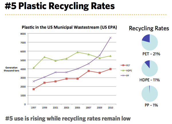
This statistical graph illustrates the generation and recycling rates of 3 common resins used in plastic between 1997-2010 in the US, and was created by The Clorox Company in 2010. The graph clearly shows that by 2010 PP has had the highest incline in generation, by about 5000 tons. But at the same time, PP also has the lowest recycling rate, making it the most produced resin, but also the most wasted. In 2010 the generation rate of the three resins sat between 4000-7500 tons in the US, while the recycling rates stayed below 25%. The main trend that can be noticed in this graph is that the resins being produced in the highest quantities seem to be recycled at the lowest rates, compared to the resins generated at a lower amount of tons. It is clear from this graph that the Clorox Company is trying to communicate the lack of recycling of plastics that is occurring, which explains why there is so much plastic waste in the ocean.
|

|
